
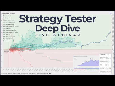
Once you create a strategy, TrendSpider allows you to run your backtest strategy and view its direction and performance through charts. In this documentation, we will explore:
- Price Behaviors Explorer Chart
- Performance Chart
- Tabular Data
Let’s get started 🚀
Here's a video which dives into some aspects of reading the backtester results (including all 3 items listed above). It is not a legitimate replacement for this article, but it can help you to see some live examples of reading what our backtester can tell you.
Price Behavior Explorer Chart
Once you've tested your strategy, you can easily access the Price Behavior Explorer (PBE) chart on the left side. This chart provides a clear view of the price movement while you were in a trading position. The PBE data offers valuable insights into how the market has been behaving during your trading exposure. You can view the aggregated statistics for all positions, winning positions, or losing positions on this chart.
The PBE chart helps answer many questions, like:
- Is my strategy capturing the moves I wanted?
- Can I cut my potential losers early?
- Where do I set up a stop loss in order to avoid it killing my future winners?
- Am I timing my trades correctly?
- Am I leaving too much profit on the table?
- Am I cutting my losses quick enough?
- How many of my trades were short living, and how many of them lasted longer?
You can use this chart to discover if you were buying and selling at the right time, as well as to discover ways to improve your exit conditions.
Price behavior chart has its X axis representing "amount of candles since entry". X values are 0 (stands for the entry candle), 1 (1 candles after entering) and so forth. Y axis is "change%". Most of the lines of PBE start at (0, 0) because at the moment of entry your change% for a given position is 0%.
There are 3 classes of elements on this chart: aggregate lines (mean, median), clouds (winners, losers) and raw data.
PBE Clouds
On the PBE chart, you'll notice a few clouds. For example, the Max/Min Winners cloud shows the price movement while you were in positions that turned out to be winners. These clouds are a visual way of illustrating how far the price moved from the entry point and the variability at each candle. For example, by looking at the Max/Min Winners cloud, you can easily determine the performance of your winning trades after 5 candles since entering and see the best and worst outcomes.
Here's an example of a Min/Max Winners cloud, which tells you something like "some winners of yours fluctuate aroudn zero barely making it, but some others go up steadily, up to +1.8% at 40th candle after entering a position".
Here’s how we compute PBE clouds. Each position you had has a “track”, which is essentially a piece of price action for the time period while you were in that trade.
Imagine that you had one position. For the first candle after your Entry, the price has changed by +1% (vs. the Entry price). For the second candle, the market kept rising and you made +2%. For the third candle, the price slightly retraced and you were at +1%. For the fourth candle, the market went up +3% and you exited (say, you’ve met your exit criteria of SMA crossing e.t.c.).
You can paint the track of this position like that:
Usually, your strategy has more than one trade after you backtest it. All the trades can have different lengths and price behavior, and here’s how the chart above would look if we added tracks of all your positions:
Pretty messy — and that’s a fairly small number of positions painted! Luckily, there’s a way to simplify the look while skill preserving most of the information. We could paint an “Average Track” line, and accompany it with two lines, such as the “25th percentile” and “75th percentile”. We could also add “Maximum” and “Minimum” lines. Here’s how it will look then:
This chart is looking rather busy, but it’s incredibly useful when you master it. In a single chart, you can instantly understand if your strategy identifies the market conditions you wanted it to identify. For example, if you’re building a trend-following long strategy, then you would want your Mean line being above zero all the time.
PBE illustrating Winners vs Losers
Most of the elements on PBE exist in 2 versions: one for Winners and one for Losers. In example, you can see Winners cloud (green) and Losers cloud (red). It is crucial to remember that these clouds are formed by positions depending on their final outcome.
It's important to note that some positions that eventually became winners may have initially been losers, and vice versa for positions that ended up being losers. This is why you might observe green clouds overlapping with the red area of negative Change%. These green clouds represent positions that experienced temporary losses but recovered to become winners. If a position remains a loser and gets closed in the red area, it would not be included in the green cloud of winners since we would classify it as a loser instead.
Mean Change% (Blue Line)
Toggle on the Mean Change % from the chart legend. The mean change% line on the chart reflects the mean (average) percentage change in returns for all positions after certain candles. You can co-relate this mean change% with the Y-axis (right) which reflects the percentage return scale and the X-axis at the bottom which reflects the number of candles from entry.
In this example, the line tells you that after 60 candles your "average position" was a winner at +0.5%, and after 143 candles your "average position" was a winner at +1.64%. Mean line suffers from the core issue of averaging: it does not give you a sense of a distribution, thereby creating illusion of returns being somewhat even. This is not the case in the vast majority of cases.
Median Change% (Purple Line)
Toggle on the Median Change % from the chart legend. The median change% line on the chart reflects the median change% in returns after certain candles. You can co-relate this median change% with the Y-axis (right) which reflects the percentage return scale and the X-axis at the bottom which reflects the number of candles from entry. This line is different from Mean only as login as Mean and Median of your returns are different. Using Median line can be your first step towards figuring your distributions.
The chart below illustrates PBE Median Change% line (violet) vs Mean Change% line (blue).
Random Control (Mean)
Sometimes the market just goes up regardless of the strategy — it’s difficult to know if your strategy is responsible or if it’s the underlying market. The same is true for extensively declining markets and short trades. When you test your strategy, you want to know what’s the root cause for your outcome: was it the strategy doing good, or simply the market going up or down?
That’s where the Random Control line comes into play. Here’s how we build it.
Imagine that you’ve backtested your strategy and your strategy generated 50 trades — the longest of them being 40 candles long. In this case, Strategy Explorer picks 50 random points on the same price chart where you tested your strategy, and collects 40-candles-long tracks starting at each of them. After that, it calculates the Average Price Behavior line (exactly the same math as behind the green “avg” line on the chart above) and paints it on your Price Behavior chart.
The usage is pretty straightforward: If you’re building a long-trading strategy and your Average Price Behavior line is above the Random Control line, then this means that your strategy has picked the time frames when market was rising better/faster than it did in general (for a given depth of backtesting). The Random Control line works the best when you’ve got a decent number of trades and when all of them are having approximately the same length (this means there’s no difference by a power of 10).
IMPORTANT NOTE: Random Control line is built using "as many random positions as you've had real positions". For a broader backtesting range this leads to Random Control line being unstable and prone to changes as you keep on backtesting (even without making any changes to a strategy) since random positions move to other places. Random Control line is only illustrative for backtests with a decent amount of positions and higher Esposure metric (60%+).
Amount Of Positions Which Made It That Far
Different positions have different life span. Some can last, some can be exited from pretty soon. There are 2 lines on PBE which help you to see how long did your positions (winners or losers) last. This is a chart which can tell you things like "The vast majority of my winners onyl last for 30 candles, but then there were few outliers which lasted 100+".
Toggle on the # of winning positions from the chart legend. This will plot the green line on the chart reflecting the number of positions that have been completed after certain number of candles from entry. Toggling this on will plot the number of positions on the Y-axis (left).
The example below tells you that the vast majority of your losers get closed from 30th to 40th candle in their evolution (the red line), while your winers do not have a cliff like that at all.
96% of Winners/Losers
This cloud illustrates how did the price behave during trades which turned up to be winners. The 2nd percentile to 98th percentile range is used to weed out extreme outliers. If you still want these outliers, then consider using Min/Max clouds.
Min/Max Change% of Winners/Losers
Toggle on the Min/Max Change% for winners from the chart legend at the bottom. This will show a green cloud on your chart.
Toggle on the Min/Max Change% for losers from the chart legend at the bottom. This will show a red cloud on your chart.
The minimum and maximum mean percentage changes are shaded on the chart to show the absolute highs and lows over certain candles.
Pre-entry clouds
The Pre Entry clouds in the Price Behavior Explorer are constructed similarly to the Change Percent clouds. They show the distribution of change percent for positions, but before you entered them. These clouds provide insights into the price action that occurred prior to entering positions that turned out to be winners or losers.
By analyzing the Pre Entry clouds, you can assess whether you are capturing the desired market movement at the desired time. They can help you determine if you are entering positions too late or too early.
For instance, let's consider a trend-following strategy. If your Pre Entry clouds show a downward slope from the top left to the bottom right, and your entry point is at the bottom, followed by upward-sloping Post Entry clouds, it suggests that you are buying during price dips instead of catching a confirmed trend. Although this may be interesting, it means you are not achieving what you intended – catching a confirmed trend. On the other hand, if your Pre Entry clouds exhibit an upward slope from the bottom to the top, and your Post Entry clouds continue in the same direction, it indicates that you are successfully capturing an established trend and then riding it.
This is just one example of how Pre Entry clouds can be used to gain insights into your trading strategy.
Raw data
The data displayed on the Price Behavior Explorer chart is derived from a set of positions and tracked using a sequence of points. Each position goes through a track that starts from zero (the entry), indicating no change percent at the beginning of the position. The next point in the track represents "one candle after entering the position", and it can be X percent. The next point is "two candles after entering", and so forth.
For example, if the first point of a position track shows 1%, it means that one candle after entering that position, the equity curve showed a 1% increase. All the statistics in the Price Behavior Explorer are built using this data.
Occasionally, you may want to examine this underlying data itself, which consists of a set of points representing the tracks of all the strategies. The raw data can appear noisy and contain numerous points, but it provides valuable insights. It is an excellent tool for visualizing the distribution of your positions and identifying outliers. Meet the Raw Data.
For example, when considering setting up stop-loss or take-profit levels, examining the raw data can be helpful. You can assess the impact of setting a stop-loss by observing how many winners or losers would be affected or eliminated.
When using the raw data, you can see points represented as squares and triangles. Square points indicate a stage in the evolution of a position which are not the final points. The position has passed through that change percent at some point in time, but it wasn't closed at that point. On the other hand, if a point is illustrated as a triangle, it represents the terminal point of a position, indicating that the position was closed, and you captured the associated profit or loss.
Understanding the distribution of triangles helps you to see what and when you are harvesting. And examining the prior square points helps you to see what you've been through before capturing your outcomes. Here's an example of a strategy which has a Stop Loss at -0.4%. See all these red triangles at a horizontal level of -0.4%: these are positions getting closed by a Stop Loss. You can also see a few triangles which go lower than -0.4%. These are occasions when the market has had gaps down, which a Stop Loss can not help with.
For example, if you observe many square points at higher levels with not much triangles, followed by triangles appearing below, it indicates that your winners are not being captured at their best potential, leading to deteriorating profits. This information can guide you in capturing bigger profits by optimizing your exit strategy.
Performance Chart
Performance chart illustrates a number of important metrics (i.e., your equity etc) and their change over time. In general, this chart has 2 types of lines:
- Lines related to the strategy. These lines are solid.
- Lines related to Buy&Hold. These lines are dashed and semi-transparent.
Here's a list of the lines Performance Chart has:
- Equity. Equity curve of the portfolio managed by your strategy. Each Y value is "change% percent since the beginning of a backtest". I.e., value of 22% means "+22% since starting the backtest".
- Equity (Asset). Equity curve of a Buy&Hold approach at a given chart.
- Positions. Lines illustrating tracks (corresponding fragmens of Buy&Hold curve) of all of the positions your strategy had.
- Drawdown. Line illustrating drawdown (peak to trough) of your portfolio.
- Drawdown (Asset). Drawdown of Buy&Hold.
- Sharpe. Trailing Sharpe ratio of your portfolio (annualized), with a length of 30 (for intraday) or 90 days.
- Sharpe (Asset). Trailing Sharpe ratio of Buy&Hold.
- Sortino. Trailing Sortino ratio of your portfolio (annualized), with a length of 30 (for intraday) or 90 days.
- Sortino (Asset). Trailing Sortino ratio of Buy&Hold.
- Realized Volatility. Trailing Realized Volatility of your portfolio (annualized), with a length of 30 (for intraday) or 90 days.
- Realized Volatility (Asset). Trailing Realized Volatility of Buy&Hold.
- Correlation. Correlation between Buy&Hold and your portfolio. Computed as Pearson of per-candle change% curves (i.e, for every candle we use change% of your portfolio since the last candle, and do the same with Buy&Hold)
Here are a few of the lines explained.
Equity (Asset)
Toggle on the Equity (Asset) the chart legend at the bottom. This is the stock price line (gray) expressed as a percentage of the first candle of a backtest. This line essentially shows the performance of buy and hold. In the example below, if you would have bought this stock and would have never sold it, then you would have lost -32.08%. However, through your trading strategy, you would have lost only -25.73%, hence you outperformed the buy and hold strategy in this case (you’ve made some decent losses still, yes).
Equity (aka Portfolio Value)
The blue line shows how much you would have made using the strategy. In this particular base, the +80% return is significantly underperforming the buy-and-hold return of +1,700% over the same period of time (e.g. 7,000 candles).
IMPORTANT NOTE: Equity curve is compounding. That is, if you start from making a +10% win, then your equity curve will display 110%. If your next trade is a +10% win as well, then the equity curve will display 121%. And so on.
Positions
Toggle on the Positions from the chart legend at the bottom. This makes some parts of the Asset Performance line green and some parts red. The green area on the line indicates that you entered the trade and you were profitable. The red area on the line indicates that you entered the trade but lost your funds.
Using the Positions lines, you can easily see if you were riding the trend.
Drawdown
Toggle on the Drawdown from the chart legend at the bottom. This shows how lows (how much you have given back) in comparison to your highs. With this, you can navigate your worst point (drawdown) in your strategy. In the example below, the worst point is at -25.73%.
Drawdown can be a result of losing trades. It also can be a result of you staying in a position while price is taking a dive (even though you could be lucky and exit later with a positive outcome). Drawdown is a good measure of a pain you'll experience when trading: high drawdown is guaranteed to be painful to watch, lower drawdown can be not as bad.
Position Contribution Chart
The Position Contribution chart provides insights into the contribution of each individual position to your overall strategy's backtest result.
The chart serves two main purposes. First, it illustrates the ratio between the impact of winners and losers (as a whole), represented by the green and red color backgrounds. This indicates which type of positions had the greatest impact. While this information may not be particularly intriguing, it is an essential pre-requisite for the next step.
Second, the Position Contribution chart consists of smaller horizontal segments within each color strip. Each segment represents the outcome of a single individual position. By observing the distribution of these segments, you can gain valuable insights. For example, if the green area is divided into small, evenly sized segments, it indicates that all your winning trades have contributed roughly equal amounts to your overall performance. Conversely, if the green area is comprised of a couple large segments and then the rest of them are smaller, it suggests that you have had a few substantial winners.
It's essential to consider the significance of such outliers in your backtest results. If your performance heavily relies on a few significant winners or losers, it's important to approach your results with caution. These outliers are less likely to be repeated in the future, unless they are inherent to the specific market conditions.
In summary, the Position Contribution chart allows you to assess whether your equity curve is progressing steadily in smaller, more even steps, or if the majority of your profits are derived from a few exceptional trades.
For example, if you had only three losing trades, for -1%, -1% and -3% respectively, then you would have a picture like this:
The chart gives you a sense of consistency of your positions’ outcomes. Here's an example of a Position Contribution from a backtest:
Here’s what you can see here:
- 66.7% (46, specifically) of your trades lost your money, 33.3% (23) were profitable.
- Each losing position has lost approximately the same amount of your money.
- Most of the profitable positions had negligible impact and there was a small number of positions (6) which gave a huge outcome, compared to others.
The interpretation of this chart could be: Your strategy was consistent at losing money, and was spiky when it comes to making money.
Position Return Distribution Chart
The Distribution of Gains and Losses is a powerful chart. The horizontal axis is “change (%)”, and each circle represents the outcome of one position. All the losing positions are painted red, all the winners are green.
Here’s what you can see here:
- The strategy was pretty consistent when losing money and the vast majority of losing trades ended up losing approximately 2.8%.
- Gains were very inconsistent. Average gain was +8.8%, and there are a few outliers standing for +20% or more.
- Average return of a trade was +1.1%. This is a positive number, which is nice.
From this chart, you can tell that the strategy has failed to deliver consistent positive results. The fact that losses were consistent definitely has something to do with our Stop Loss level, so one might want to try tweaking it. For example, you might move Stop Loss level to a wild -50% , then you get a picture more along these lines:
You can see that your average return is still modest, but your losses increased. So, having a sane stop loss level seems to be a good idea for this strategy (who could possibly imagine!!).
Tabular Data
We do display some high-level metrics of your strategy in a table view. Like, Win Rate, Reward-to-Risk ratio e.t.c. These numbers are useful if you want to see a rough summary (i.e., R/R + Win Rate + Expectancy) without diving into the details. It’s also useful if you want to compare a few strategies (you can copy the tabular data, paste it into a spreadsheet and compare).
The meaning for each of the metrics in the Tabular Data has been explained in the table below:
| Metrics | Interpretation |
| Asset Performance | Represent what would have happened if you bought and held the asset the entire time |
| Average Loss | Represents the average of a losing trade. |
| Average Return | Represents the average of a series of returns generated over time as analyzed in the backtesting. |
| Average Win | Represents the average of a winning trade. |
| Avg. Length | Average duration of a position, in candles |
| Beta Vs. Asset | Represent how close the value of the buy/sell strategy is relative to the price (e.g. does it move with the price or not). |
| Corr | Correlation between your strategy and Buy&Hold (Pearson of per-candle change% lines) |
| CAGR, 2y | Compound annual growth rate, over last 2 years |
| CAGR, 3y | Compound annual growth rate, over last 3 years |
| CAGR, 4y | Compound annual growth rate, over last 4 years |
| CAGR, 5y | Compound annual growth rate, over last 5 years |
| Data Analyzed | Represents the time for which the data has been analyzed in the backtesting |
| Expectancy | Represents the average amount you can expect to win or lose per trade with your strategy when a large number of trades are taken. (rrRatio * winRatio) - lossRatio |
| Exposure | Percentage of the overall time range the strategy has spent in positions |
| Loss St.dev | Standard deviation of returns, for losing trades |
| Loss Streak, avg | Average amount of consequtive losing trades |
| Loss Streak, max | Max amount of consequtive losing trades |
| Losses | Represent the percentage and number of lost trades out of the total trades analyzed. |
| Market | Represents the symbol on which the backtesting has been performed |
| Max DD (Asset) | Max drawdown for the asset (aka the Buy&Hold strategy) |
| Max DD | Represents the biggest pullback of your portfolio (equity curve) in terms of the percentage. The smaller this percentage, the better it is. |
| Net Perf, 1mo | Net performance over last 1 month of a backtest |
| Net Perf, 1y | Net performance over last 1 year |
| Net Perf, 2y | Net performance over last 2 years |
| Net Perf, 3mo | Net performance over last 3 months |
| Net Perf, 3y | Net performance over last 3 years |
| Net Perf, 4y | Net performance over last 4 years |
| Net Perf, 5y | Net performance over last 5 years |
| Net Perf, 6mo | Net performance over last 6 months |
| Net Perf, all | Performance of this strategy for the backtest period |
| Positions | Represent the number of positions/trades analyzed during the backtesting |
| R.vol | Realized volatility of the strategy equity curve, for the entire backtest. Average value of a 90d trailing metric for the period of a backtest |
| R.vol (Asset) | Realized volatility of Buy&Hold, for the entire backtest. Average value of a 90d trailing metric for the period of a backtest |
| Return St.dev | Standard deviation of returns, for all trades |
| Rew/Risk Ratio | Represents the Reward vs Risk ratio which measures the profit potential of a trade relative to its potential loss. Mathematically, that's avgWin / avgLoss |
| Sharpe | Sharpe ratio, average value of a 90d trailing metric for the period of a backtest |
| Sharpe (Asset) | Sharpe ratio of Buy&Hold, average value of a 90d trailing metric for the period of a backtest |
| Sortino | Sortino ratio, average value of a 90d trailing metric for the period of a backtest |
| Sortino (Asset) | Sortino ratio of Buy&Hold, average value of a 90d trailing metric for the period of a backtest |
| Trades/Day | Average amount of trades per day |
| Trades/Month | Average amount of trades per month |
| Win St.dev | Standard deviation of returns, for winning trades |
| Win Streak, avg | Average amount of consequtive winning trades |
| Win Streak, max | Max amount of consequtive winning trades |
| Wins | Represent the percentage and number of winning trades out of the total trades analyzed |
Our Tabular Data view has a feature of highlighting metrics which are an obvious no go. I.e., if your Expectancy metric is negative, then it means that this strategy is losing money. A number highlighted also has a hint, so you can point your mouse to it in order to learn more.
Most of the principles behind these “no go” labels are straightforward, but one of them demands an explanation: relation between your Reward/Risk ratio and your Win Rate (% of winning positions).
Sharpe ratio
The Sharpe ratio is a widely used measure of risk-adjusted return in finance. It helps assess the performance of an investment strategy by taking into account both the returns generated and the level of risk taken. The ratio is calculated by dividing the excess return (returns above the risk-free rate) by the standard deviation of those returns. A higher Sharpe ratio indicates a better risk-adjusted return. When backtesting your strategy, you can use the Sharpe ratio to compare different strategies and determine which one provides the highest risk-adjusted returns. It helps you evaluate the trade-off between risk and return and make informed decisions about your investment strategy.
Sharpe you're seeing in Tabular Data is an average value of a 90d trailing Sharpe metric across the entire backtest range. The picture below illustrates the matter: the black line is a trailing 90 days Sharpe metric of a strategy. Average value (see the avg line) is what you'll see in Tabular Data.
Sortino ratio
The Sortino ratio, similar to the Sharpe ratio, is a measure of risk-adjusted return used in finance. However, the Sortino ratio specifically focuses on downside risk by considering only the standard deviation of negative returns (or downside deviation) in its calculation, while the Sharpe ratio considers the overall standard deviation. A higher Sortino ratio indicates a better risk-adjusted return specifically in relation to downside volatility. When backtesting your strategy, you can use the Sortino ratio to assess the performance of your strategy in managing downside risk and compare it with other strategies. It helps you evaluate the efficiency of your strategy in protecting against losses and may be particularly useful if your investment goals prioritize avoiding downside risk over general volatility. There's a great article on the CME website about Sortino, check it out!
Sortino you're seeing in Tabular Data is an average value of a 90d trailing Sortino metric across the entire backtest range. See the illustration for Sharpe for better understanding.
How we compute Sharpe and Sortino
Sharpe and Sortino ratios which we calculate are trailing metrics. Each of them uses a sliding window that depends on the timeframe of your backtest. For shorter timeframes, like 15 minutes, the window size is smaller (like 30 days), while for a backtest on a Daily chart it will be 90 days.
We compute these metrics day by day, moving from left to right, similar to how a simple moving average is calculated. When calculating the ratio, we use the risk-free return ratio from the corresponding point in time. For example, if we are calculating the Sharpe ratio for Jan 2020, we use the risk-free return ratio from Jan 2020. To be specific, if we are computing Sharpe for a time span of DateA ... DateB then risk free return rate we use will be computed as average of all the risk free return rate data points which fall into the same time range DateA ... DateB.
When calculating the Sharpe ratio, we use "daily performance". We separate your equity curve into days, and then we compute trailing Sharpe day by day. The same principle applies to the Sortino ratio and the realized volatility calculation. Be aware that it might create biased estimates for intraday strategies. The approximate formula for Sharpe in our case is as follows
Sharpe = (DAILY_PERF - RISK_FREE_DAILY_PERF) / stdev(return) * sqrt(BUSINESS_DAYS_IN_YEAR);
The risk-free return rate we use is based on the 10-year bond yield, sourced from the Federal Reserve. You can access and verify this data in the "Other Data" tab using the provided free data.
Metrics changing as you adjust the strategy
Any time you run yet another backtest, we highlight changes in your metrics. We track all the metrics except of Market, Data analyzed and Asset Performance. You will see comparison against "previous value of the corresponding metric" labels, next to the value of a corresponding metric. This comparison is straightforward, so even if you choose and backtest a different strategy, you will see the comparison — even though it might make not much sense, provided that the strategies are different. The idea is to compare "current results of a backtest" vs "previous results of a backtest", never mind what exactly you have backtested.
Each comparison label has a tooltip (if you point your mouse to it) explaining its meaning. Comparison labels have 3 attributes:
- color
- direction of a change
- value of a change
1. Color of a comparison label
Color of a comparison label tells you whether the metric has improved (became better from standpoint of trading) or degraded. The label is green for improvement and red for degradation.
2. Direction of a change
In case if numeric value of a metric goes down, you will see a ▾ mark for it. In case if numeric value goes up, you will see ▴. For the metrics which are negative by their nature (drawdown and average loss), marks will be inversed.
3. Value of a change
The number per se is a discrepancy between current value of a metric and its previous value. Value is always expressed in absolute units, the same units the metric uses.
Examples of how to read metric change
- Max.Drawdown: Current value
-5.72, comparison labelred, ▴2.52. That means that your max drawdown has got worse, its absolute value went up by 2.52 and now it's -5.72. One can see that it also means that the drawdown was-3.20before this backtest. - Win%: Current value
72, comparison labelgreen, ▴12. That means that your Win% has improved, it went up by 12 and now it's 72. One can see that it also means that the Win% was72 - 12 = 60before this backtest.
Minimal Win Rate you need in order to stay above the water with a given R/R ratio
You can intuitively guess that in case if your Reward/Risk is 3 (i.e., any time you win, you get 3%, any time you lose, you lose 1%) then winning 1 time buys you a few potential losses: you can win once, and then making a few (remember about compounding percentage!) losses in a row will still keep your portfolio being “not less than in the beginning”. If you make “yet another loss”, then you’ll start losing money. You can tell that there is some kind of a “minimal Win% for the purpose of not losing money” for your R/R ratio.
We have figured that you can easily compute these “minimal Win%” values. We have built a simulation and then approximated the result with a regression model. Here’s a chart.
From this chart, you can tell that with R/R of 4.0, your minimal Win Ratio is ~25%. With an R/R ratio of 1.5, you need to have a win in 50% cases, and so forth. This model is not strict (we might be off by a few percent) but you can use it as a rule of a thumb when estimating the quality of your strategy. In case if your Win% is too low for a given R/R ratio, TrendSpider will tell you so, by highlighting your Win% and making a comment on it.
What went wrong? (Optional)